Navigation menus that visitors actually use
September 9, 2026 · Design and Layout · David Semones
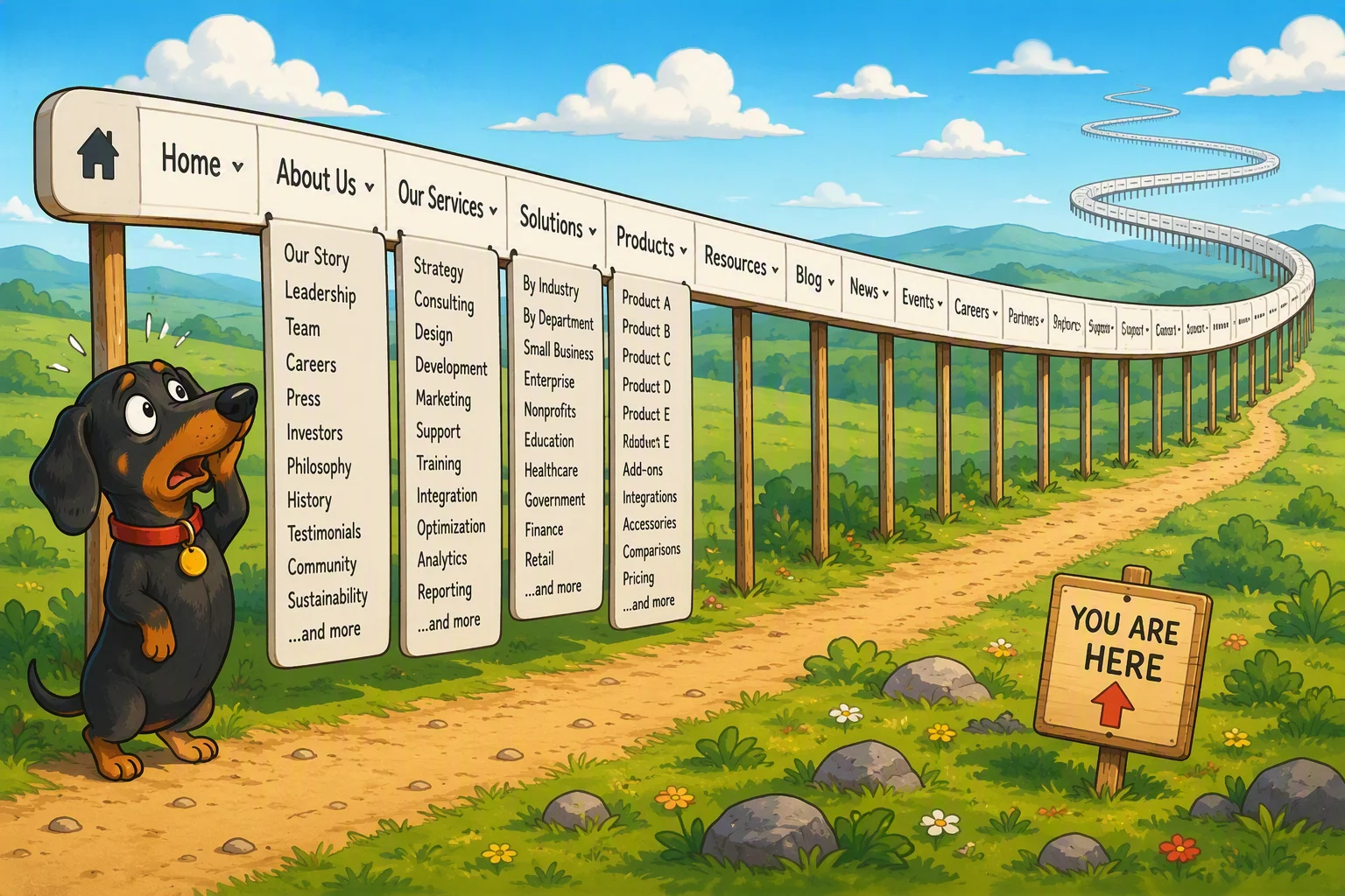
A navigation menu that visitors actually use is short (five to seven items), uses plain labels instead of clever ones, sits at the top of the page where people expect it, and always makes it obvious which page they're currently on. That's the whole formula. Everything else is detail on how to pull it off.
Most menus fail for a simple reason: the business owner knows their site so well that they forget the visitor doesn't. You know that "Solutions" means your services page. A stranger landing on your site for the first time doesn't, and they won't click something they can't decode in half a second. So they leave, or worse, they call you asking a question your website already answered.
How many items should a menu actually have?
Five to seven. That's not a rule pulled from nowhere, it's about how people scan a screen. When someone lands on your site, they glance at the top for a second or two, looking for a word that matches what they came for. If your menu has ten or twelve items, they have to actually read it, and reading takes effort most visitors won't spend. They'll either guess wrong or give up.
If you're staring at a menu with too many items, the fix is almost always to group things, not delete them. "Services" can hold a dropdown with your five offerings instead of five separate menu slots. "About" can cover your story, your team, and your location on one page with clear headings, instead of three thin menu items. The goal isn't to hide content, it's to give the visitor fewer decisions to make at the top level.
What should the labels actually say?
Say what the page is, not what you'd like to call it. "Home," "About," "Services," "Pricing," "Contact" outperform "Our Story," "What We Do," "Get Started" almost every time, because a visitor doesn't have to stop and translate them. This feels boring if you're the one writing the menu, but boring is exactly what works, because the visitor isn't there to admire your wording. They're there to find a phone number, a price, or proof you do the thing they need.
A useful test: hand your menu to someone who's never seen your site and ask them what each label means before they click it. If they hesitate or guess, rename it. "Portfolio" is fine for a photographer, but "Our Approach" is a guess for almost anyone. When SimplePath builds out a site's structure, it defaults to these plain, expected labels for exactly this reason. Clear beats clever, every time, in navigation.
Where should the menu sit, and does that actually matter?
Yes, it matters more than most business owners expect. Visitors have learned, from years of using thousands of other websites, that navigation lives across the top of the page or, on phones, behind a small icon made of three stacked lines (often called a "hamburger menu") in a top corner. When you move navigation somewhere unexpected, like a footer-only menu or a sidebar that only appears on some pages, you're forcing every visitor to relearn your site instead of just using it.
This is also why consistency across pages matters so much. If your menu has six items on the homepage but drops to four on your services page, or the order shifts around, visitors notice, even if they couldn't tell you why the site suddenly feels harder to use. Keep the exact same menu, same order, same wording, on every page. It should be the one constant while everything else on the page changes.
How do visitors know where they are once they've clicked?
This is the piece most menus get wrong, and it's an easy fix: show the current page as active. That usually means a different color, a bold label, or an underline on whichever menu item matches the page someone's looking at. Without it, visitors lose their bearings, especially on sites with several levels of pages, and they'll often just hit the browser's back button rather than hunt for where they are.
The same logic applies to breadcrumbs, the small trail of links often shown near the top of a page (something like Home > Services > Web Design) that shows a visitor the path they took to get there. You don't need breadcrumbs on a five-page site, but once a site grows past a couple dozen pages, they stop a lot of the confusion and back-button clicking that kills otherwise good navigation.
Your next step
Pull up your site right now on your phone and your laptop, and count your menu items. If you've got more than seven, or if any label made you pause and think "what does that even mean," that's your starting point. Fix the labels first, since it costs nothing and takes ten minutes. Then look at grouping. Navigation this plain won't feel exciting to build, but it's exactly what gets visitors to the page they came for instead of back to a search results page looking for a competitor.
Drafted with SimplePath's own AI blog, then updated and published by David before it went up. It's the same tool included with the Grow plan. See how it works.