Button sizes and shapes that feel clickable
November 13, 2026 · Design and Layout · David Semones
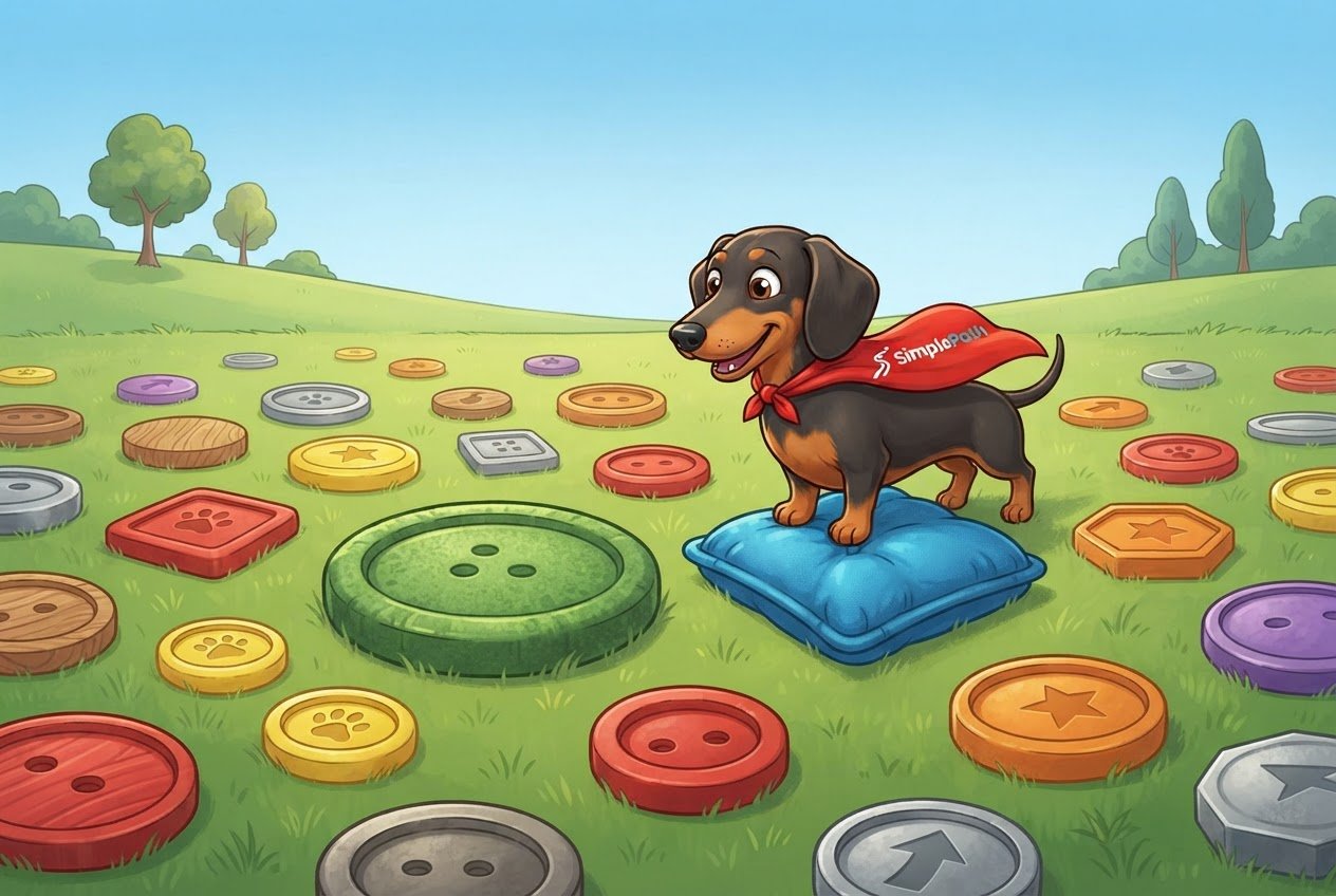
A button feels clickable when it's at least 44 by 44 pixels (roughly the size of a fingertip), filled with a solid color that stands out from the background, given slightly rounded corners, and labeled with what happens when you press it. Get those four things right and most visitors will never have to think about whether something is a button. That's the goal.
If you're not a designer, don't worry. None of this needs special tools or code. Here's what each piece means and how to check your own pages.
How big should a button be?
Aim for at least 44 by 44 pixels, and go a bit larger for your main button. A pixel is one tiny dot on a screen, so this is a measurement of how much room a finger gets. Apple's design guidelines suggest 44, Google's suggest 48, and accessibility standards set a bare minimum lower than that. Using 44 to 48 keeps you safe on every phone.
A few rules of thumb that go with it:
- Give the label breathing room. The button should be noticeably bigger than its words. If the text touches the edges, it looks like a cramped label, not something to press.
- Leave space between buttons. About 8 pixels apart is a good minimum. Buttons packed tightly together cause mis-taps, which is frustrating on a phone.
- Make the main button full width on phones. On a small screen, a button that stretches across the page is easy to hit with either thumb.
The quick test: hold your phone in one hand and tap each button with your thumb. If you miss, or have to aim carefully, it's too small.
What shape and style tells people it's a button?
A solid rectangle with softly rounded corners is the shape people recognize most. Corners rounded just enough to look friendly (not a full pill or a sharp box) have been the standard for years, and that familiarity is the point. People don't have to learn anything.
Beyond shape, three things do most of the work:
- Fill it with color. A solid background reads as pressable. Plain text with no background reads as, well, text. Choose a color that clearly differs from the page around it.
- Check the contrast. The label needs to be easy to read against the button color. The common accessibility target is a contrast ratio of 4.5 to 1. Free contrast checkers will tell you the number if you type in your two colors. Light gray text on white fails this test, even when it looks stylish.
- Pick one star per screen. Your main action (Buy now, Get a quote, Sign up) gets the bold filled button. Secondary actions get a quieter style, like an outline with no fill. If every button shouts, none of them stands out.
The words matter as much as the shape. "Submit" tells a visitor nothing. "Send my message" or "Get a quote" tells them exactly what happens next, which makes people more willing to press it. Start with a verb and keep it to a few words.
What small details make it feel responsive?
A button feels clickable when it reacts to you. On a computer, the button should change slightly when the mouse moves over it, usually a shade darker, and the cursor should turn into a pointing hand. On a phone, it should visibly change for a moment when pressed. That tiny response confirms the tap registered, so people don't tap again and wonder if something broke.
Two things to avoid:
- Don't dress up things that aren't buttons. If a colored box with rounded corners does nothing when clicked, visitors will try it, fail, and trust your site a little less.
- Don't hide links in plain text. Links inside a paragraph should be underlined or clearly colored. If the action is important, make it a real button instead.
Consistency helps too. Use the same size, shape, and color for every main button across the site. Once a visitor learns what your buttons look like, they'll spot them on every page without effort.
Your next step
Open your site on your phone and look at one page. Can you spot the main button in a couple of seconds? Can you tap it easily with a thumb? Does the label say what it does? Fix whichever answer is no, and you've made a real improvement.
If you're building from scratch, SimplePath lets you describe your site in plain words and builds it for you, so you can say something like "make the main button bigger and a solid color" instead of hunting through settings. You can see what SimplePath can build, from simple sites to stores and member areas. Already have a site? The free website grader will score it, and if you'd like a hand with any of this, get in touch.
Drafted with SimplePath's own AI blog, then updated and published by David before it went up. It's the same tool included with the Grow plan. See how it works.