Call to action buttons that actually get clicked
September 8, 2026 · Winning Customers · David Semones
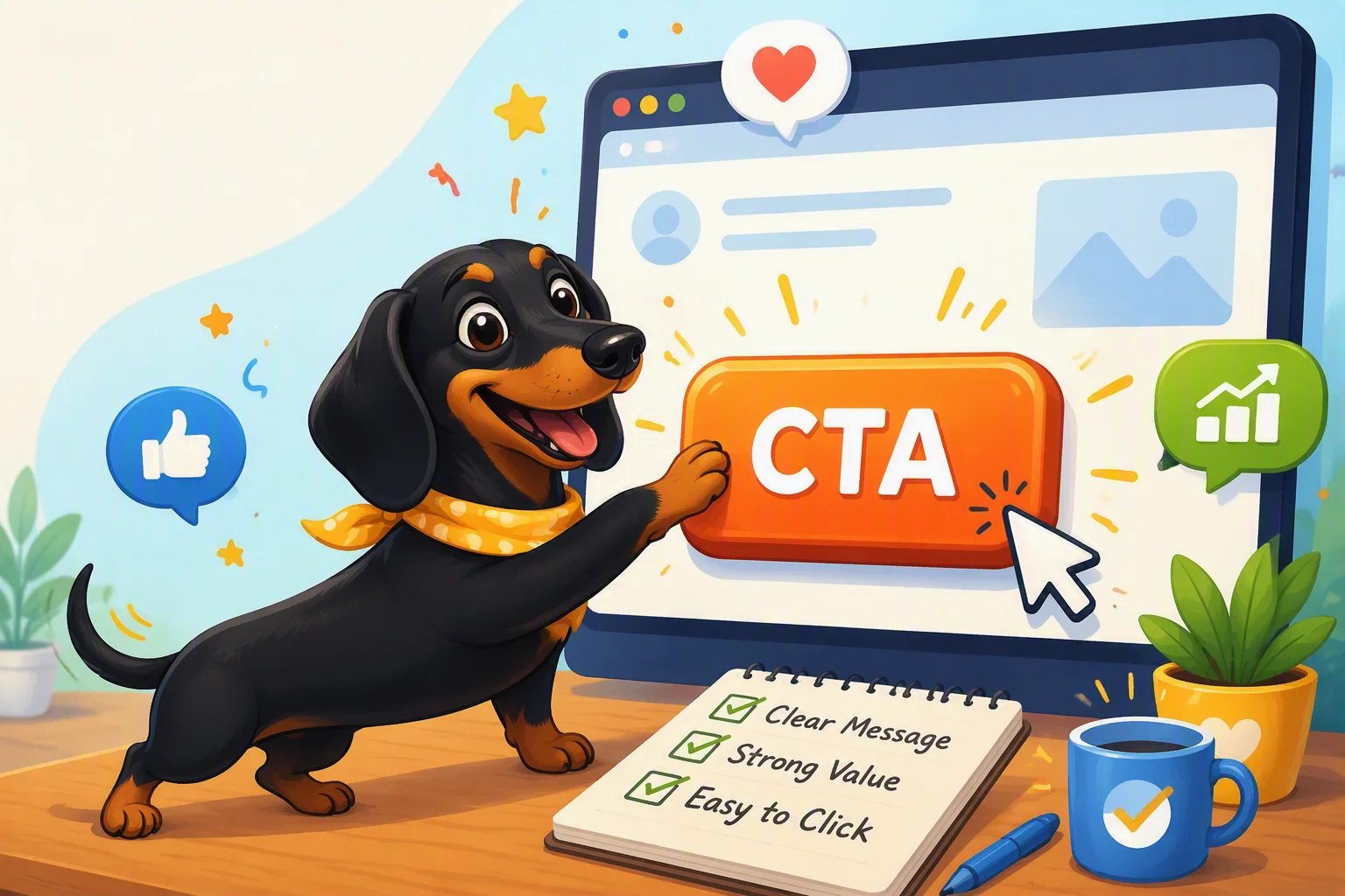
A call to action button (people usually just say "CTA") gets clicked when it does three things at once: it tells the visitor exactly what will happen if they click, it looks different enough from everything around it that the eye finds it without effort, and it shows up at the moment the visitor is actually ready to act, not before. Buttons that fail usually get one of these wrong, not all three. The good news is that all three are fixable without knowing any code.
Why most CTA buttons get ignored
If you've ever built a website yourself, you know the temptation: the button goes in because a page "needs" one, not because you thought hard about what it says. That's how you end up with a button that just says "Submit" or "Click Here." Neither one tells the visitor anything. Submit what? Click here for what? A visitor who has to guess usually just... doesn't click.
The other common failure is visual. If your button is the same color as your headlines, or it's the same size and shape as three other buttons on the page, the visitor's eye has no reason to land on it. People skim websites the way they skim a menu: fast, and only stopping where something looks important. Your button has to look important.
The third failure is timing. A "Buy Now" button at the very top of a page, before the visitor knows what you sell or why it matters, is asking for a decision nobody's ready to make yet. Same button, placed after you've explained the benefit, gets a completely different response.
What to actually write on the button
Skip generic verbs like "Submit," "Click Here," or even plain "Learn More" when you can be specific instead. The best button text answers the question "what happens if I click this?" in three to five words:
- Instead of "Submit": "Get My Free Quote" or "Send My Message"
- Instead of "Click Here": "See Pricing" or "View the Menu"
- Instead of "Learn More": "See How It Works" or "Compare Plans"
- For booking or scheduling: "Book My Appointment" or "Check Available Times"
Notice the pattern: most of these use "My" instead of "Your." It's a small word change, but "Get My Free Quote" reads more like something the visitor is doing for themselves, rather than a command from you. It sounds small, but it's one of the more reliable wording tweaks out there.
Keep it short. A button crowded with text is harder to read at a glance, and glance-reading is exactly what's happening when someone scrolls past it. If you need to explain more, put that explanation in a sentence above the button, not on the button itself.
Making the button impossible to miss
Color does most of the work here, but not in the way people assume. The button doesn't need to be your brand's main color. It needs to be a color that appears nowhere else on the page, so it stands out by contrast. If your site is mostly blue and white, a button in that same blue will blend right in. An orange or green button on that same page jumps out immediately, purely because it's the odd one out.
Size and space matter too. Give the button room to breathe: some blank space around it so it's not squeezed between paragraphs or images. And make sure it looks clickable, meaning it has a visible border or background, not just plain text in a different color, which many visitors won't even register as a button at all.
On phones especially, buttons need to be big enough to tap with a thumb without also tapping the link next to it. If you've ever gotten frustrated trying to tap a tiny button on someone's website, your visitors have felt that too, and they usually just give up rather than zoom in and try again.
Where to put it (and how many to use)
Put your main CTA in three places: near the top so visitors who already know what they want can act right away, once in the middle after you've made your case, and again at the bottom for anyone who read the whole page before deciding. That's usually enough. A page with a button after every single paragraph starts to feel like it's begging, and it dilutes the one action you actually want people to take.
If you genuinely have two different goals, like "Book a Call" and "Download the Guide," make one of them visually secondary, a plainer button or a text link, so the visitor's eye still goes to the action you care about most.
Put it into practice
Go look at your own site right now and find your main button. Read the text out loud: does it say what happens next, or does it just say "Submit"? Then step back and squint at the page: does the button jump out, or does it disappear into everything around it? Fix those two things first, before worrying about anything else.
If you're building or rebuilding your site and want this kind of thing handled automatically rather than fussed over page by page, that's part of what SimplePath is built for: it helps you put together a site with clear, well-placed calls to action from the start, without needing to learn design or code to get there.
Drafted with SimplePath's own AI blog, then updated and published by David before it went up. It's the same tool included with the Grow plan. See how it works.